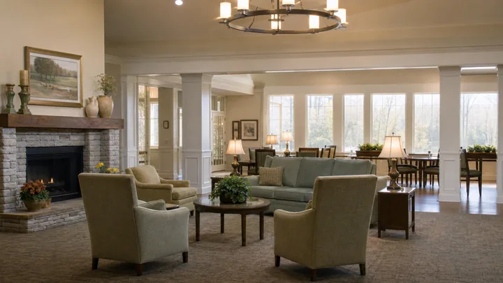
Age-related changes, cataract, and eye disease can reduce contrast sensitivity and change color discrimination, but they do not affect every resident in the same way. A low-contrast scheme may make functional edges harder for some people to locate. Designers should evaluate actual luminance contrast, lighting, glare, and representative user needs rather than rely on a stylized simulation of an “aging eye.”
This is not an argument for primary-colored institutional cheer. It is an argument for spending contrast deliberately: strongly where an edge carries useful information, quietly where a false edge could mislead. Contrast is one layer of accessibility, not a substitute for layout, lighting, mobility support, or individualized assessment.
Where the evidence stands
Common age-related vision changes can include reduced contrast sensitivity and more difficulty distinguishing some colors; cataract and eye disease add substantial variation. See the National Eye Institute’s aging-vision summary. Value contrast at functional edges is a useful low-vision design principle, but no palette guarantees independent use. Evidence for colored tableware and intake is limited and intervention-specific, so this article makes no clinical-outcome promise.
Value first, hue second
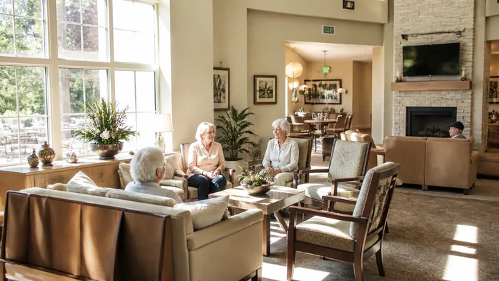
A grayscale image is a quick screen for relative light-dark value; it does not simulate aging vision, cataract, low vision, or dementia and it does not replace measured contrast or user testing. Photographing a scheme or viewing samples through a grayscale filter can reveal pairings that depend on hue alone. Evaluate functional pairings under the room’s real lighting and with representative users wherever possible.
The edges that earn contrast

Spend your contrast budget on the edges residents' bodies depend on, roughly in this order.
Seat against floor
Lowering oneself into a chair is a controlled fall aimed at a target; a target the same value as the floor is a missable one. Seat upholstery should stand out clearly from the flooring beneath it, which also makes chairs findable across a room by someone scanning for a place to rest. (The chair itself must then hold up its end of the bargain: see sit-to-stand design.)
Table against everything
The table edge is where hands land, cups park, and plates sit. Distinguishing the table, place setting, and food by value can be a useful design strategy, but the limited dining-intervention literature does not establish one universally superior plate color or finish.
Fixtures against walls
Bathrooms are a useful place to evaluate functional contrast: fixtures, controls, and grab bars that disappear into their backgrounds may be harder for some users to locate. Contrast can improve visibility, but independent bathroom use also depends on layout, reach, strength, cognition, lighting, and the individual care plan.
Doors, handles, switches
Doors residents should use want frames or leaves distinct from the wall; hardware wants value contrast against the door. The same tool works in reverse. Doors residents should not fixate on (service spaces) can be painted to the wall and visually retire. Contrast is information; its absence is, too.
Where contrast must be quiet
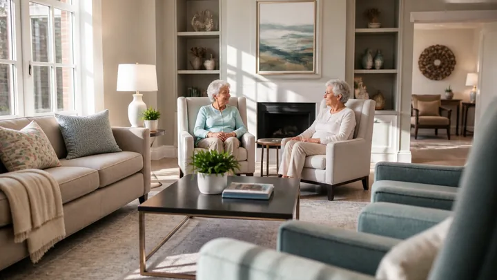
The same eye that needs edges marked is misled by edges that aren't there. Strong value changes on the floor read as steps, holes, or barriers: the dark border tile, the contrasting runner, the bold carpet inset all produce the hesitation and probing steps described in flooring transitions. Busy pattern is the other liar: high-frequency, high-contrast pattern on floors and stair carpets reads as texture or debris; on upholstery it hides the food stain the housekeeper needs to find and dissolves the seat edge the sitter needs to see. Floors should be the calmest value field in the room, changing only where the building genuinely changes.
The blue problem, and other hue notes

Because color discrimination can change with age, cataract, and eye disease, never encode important information by hue alone. Check light-dark contrast, lighting, glare, and legibility with representative users; no warm or cool palette is universally more visible.
Sheen is part of color
A finish's gloss changes its value moment to moment: a satin wall reads pale gray until the afternoon sun turns it into a mirror; a polished dark floor reads as light, or as wet, under every window. Aging eyes, already scatter-prone, suffer disproportionately from this instability, which is why the matte preference in the lighting article is also a palette rule: choose colors and sheens together, and evaluate samples under the room's real light at the room's real hours, horizontal samples flat on the floor, not held at arm's length in a showroom.
Signage and print: the same rule at reading distance
Everything above applies at arm's length too. Signs, menus, activity calendars, and room numbers live or die on value contrast and size, not on elegance: dark characters on a light matte ground (or the reverse) with genuine value separation, faces sized for aging eyes at the real viewing distance, and no gray-on-gray, no lettering over photographs, no brushed-metal plaques that vanish into glare. Mount signs where a stooped or seated person's gaze actually falls, lower than hospitality convention, and light them as deliberately as artwork. A community that gets its palette right and its print wrong has fixed the room and left the resident unable to confirm which room it is.
The audit
Photograph every shared room and every resident bathroom from standing and seated heights, convert the set to grayscale, and read the results against two lists: edges that must show (seat/floor, table/floor, plate/table, fixture/wall, handle/door, stair nosings) and surfaces that must stay calm (floors, stair runs, upholstery pattern). Most buildings fail in both directions at once: invisible toilets and alarming carpet borders in the same wing. The repairs are mercifully incremental: reupholster the seats before the walls, swap the tableware before the flooring, paint the bathroom wall behind the fixtures before retiling anything. Value contrast is the rare accessibility layer that costs nothing at specification time and looks, when done well, like nothing at all: just a room where residents keep finding the chair, the plate, and the door, and nobody can quite say why the building feels easy.
Sources and scope
These primary and research sources anchor the subject area; they do not turn every design recommendation in this article into a proven outcome. Verify current law, adopted code, licensing rules, care plans, and clinical requirements for the specific property.