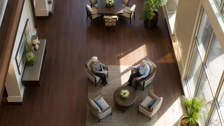
In most senior living buildings, the corridor is the largest single room nobody designed. It got its width from code, its length from the unit count, its lighting from a ceiling grid, and its character from whatever was left in the finishes budget. Yet it is where residents spend a surprising share of their mobile lives, and for many, it is the only gym they will ever use. A resident who walks the corridor twice a day is maintaining strength, balance, appetite, and social contact. A resident who stops walking it has begun the quiet slide toward the wheelchair, the room tray, and the shrinking world. The corridor is not circulation. It is infrastructure for staying upright.
The problem is that most corridors actively discourage the walking they depend on. They are long, featureless, glare-lit tubes with nowhere to rest, nothing to look at, and nothing to arrive at. An older adult contemplating that tube makes a rational calculation (can I make it there and back?), and the tube gives her every reason to say no. Design the corridor so the answer is yes, and you have built the cheapest fall-prevention, deconditioning-prevention program available to you.
Principle vs. proven
That regular walking preserves strength, balance, and independence in older adults is about as well-established as anything in geriatric health; resources from the National Institute on Aging treat mobility maintenance as foundational. That specific corridor features (rest intervals, destinations, daylight) increase voluntary walking is design principle and practitioner consensus rather than settled quantitative science. We think the logic is sound and the cost of acting on it is low. We won't pretend there's a percentage attached.
The calculation every walker makes

Watch a resident pause at her doorway before setting out, and you can almost see the arithmetic: distance to the dining room, energy available today, places to stop if it goes badly, embarrassment if it goes very badly. Every design move below works on one of those variables. Shorten the perceived distance, guarantee the rest stop, dignify the pause, and give the trip a point: that is the whole program.
Rest is the route
The single highest-yield intervention is seating at honest intervals: close enough together that a tiring walker can always see the next place to sit. The seat must be a real one: arms, firm cushion, a height an older adult can rise from, per the same sit-to-stand principles that govern every chair in the building. A bench without arms is corridor decoration. And the pause must read as normal life, not failure: a chair beside a window, a two-seat alcove with a lamp and a picture, a spot by the aviary. Nobody wants to be seen resting on a medical bench halfway to lunch. Everybody is happy to be seen enjoying the window seat.
Something at the end, something along the way
A corridor that dead-ends at a fire door is a corridor that teaches residents not to bother. Give the route a destination (a lounge, a window with a real view, a coffee alcove, the mail boxes, a door to the garden) and give it incident along the way: artwork hung at the eye height of a seated or stooped viewer, a memory case, a bookshelf, a window into an active room. Landmarks do double duty, breaking the tube into legible segments (this is the same logic as dementia-friendly wayfinding, and it helps everyone) and giving the walk the small narrative pleasures a street gives a pedestrian. The best corridors read less like hallways than like a village lane: short legs, turns with a reveal, somewhere to get to.
The handrail that isn't ashamed of itself
Handrails are where dignity and function collide. Residents use them constantly, and resent what they signify, which is why the rail disguised as a chair rail or ledge so often fails at both jobs. The design answer is a rail that is genuinely good to hold (graspable profile, continuous around corners, returns to the wall, mounted at a consistent usable height, in a finish warm to the touch) and visually integrated rather than institutionally afterthought: a timber rail against a contrasting wall band reads as architecture, not apparatus. Accessibility standards (see access-board.gov) settle the geometry; the finish schedule settles whether anyone is embarrassed to use it.
Light and floor: the silent vetoes
Two features veto walking before it starts. The first is glare. A polished floor under a window at the corridor's end turns the route into a sheet of light that aging eyes read as wet or as a void, and pattern or high-contrast borders on the floor read as steps and edges to a cautious walker. Matte finishes, even lighting without dark gaps between fixtures, and calm flooring are not aesthetic preferences; they are the difference between a route and a hazard-perception test. The second veto is traffic: a corridor doubling as cart park and equipment lay-by (lift stored at the turn, meds cart at the nurse station pinch point) tells walkers the route belongs to operations, not to them. Walk your own building at ten in the morning and count what a resident must steer around; then find those objects a home that is not the route.
Width, flow, and the two-walker problem
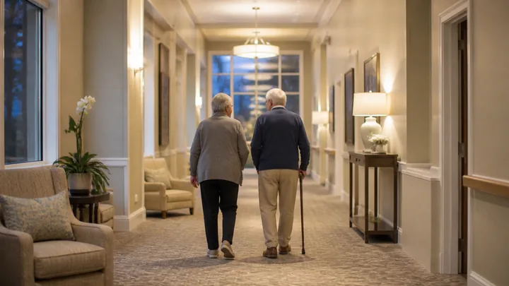
Code minimums get a stretcher through; they do not make a street. The functional test is social: two residents with walkers, meeting mid-corridor, should be able to stop and talk without blocking passage, because those encounters are half the reason to walk. Where the plan allows, widen at intervals into bays rather than uniformly: a corridor that swells at the window seat and narrows between reads as a sequence of places. Where the plan is fixed, keep the clear width honest by policing storage creep (see above) and choosing wall-mounted rather than floor-standing everything.
Loops beat laps
If the plan permits, a continuous route can offer an alternative to repeated out-and-back travel and may support purposeful walking. It is not mandatory in memory care and does not eliminate fall, fatigue, elopement, or wayfinding risk. Route design should be individualized to the population and reviewed for accessibility, supervision, rest points, destination cues, life safety, and secure egress. Any distance goals belong to an individual care or activity plan, not a generic number of laps.
Program the pavement
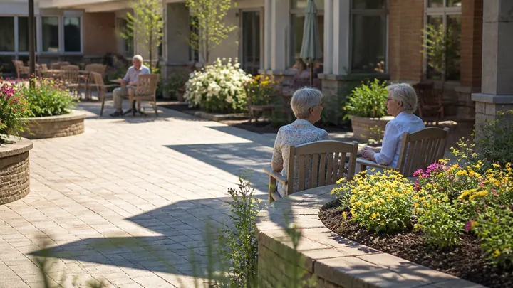
Architecture sets the stage; operations fill it. A walking group that meets at ten. Coffee served at the far lounge, so the corridor has a morning tide. The mail kept at modest distance from the units: a daily errand is a daily walk. Staff trained to walk with residents rather than wheel them when time is short (the chair is faster today and costs a walker tomorrow). None of this spends capital; all of it spends intention. The building can only invite.
The audit
Do the seated-height walkthrough, then do the walker version: borrow a rollator and travel your longest resident route at a genuine eighty-five-year-old pace. Note every point where you wanted to sit and couldn't, every stretch of glare, everything you steered around, and how the trip felt as a story: was there anything to see, anywhere to get to? Then stand at the dining room door at eight in the morning and count who arrives on foot. That number is your corridor's report card, and it responds to design faster than almost any metric in the building.
Sources and scope
These primary and research sources anchor the subject area; they do not turn every design recommendation in this article into a proven outcome. Verify current law, adopted code, licensing rules, care plans, and clinical requirements for the specific property.