Jump to a section
Build samples around real combinations
Put flooring, upholstery, wall finish, and trim samples together in the room where they will be used. Look at them in daylight and under the installed lighting. Small catalog swatches do not show how a larger surface will read across a room.
Ask residents which objects are difficult to identify, and record the exact location. Avoid deciding that one color is right for all older adults or all memory-care settings.

Highlight what someone needs to use
Review the edges of seats, usable handles, essential signs, and relevant tableware. Aim for a clear relationship between the object and its background. Check the object from the actual approach and seated positions, including when it is partly hidden by other furniture.
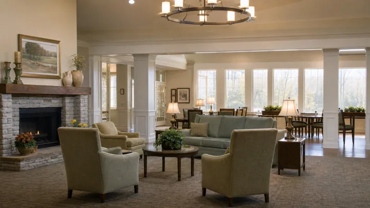
For example, an armchair may look distinct against a sample wall yet blend into the floor when viewed from the corridor. Evaluate the whole arrangement rather than approving the upholstery alone.

Avoid adding visual confusion
A high-contrast feature is not useful simply because it attracts attention. Ask what it communicates. A strong stripe across a walking route or a busy rug pattern may not provide the intended information.
Review proposals with the relevant design and care team, particularly in memory care. Use resident feedback to assess individual responses. Keep required signage and life-safety information recognizable rather than changing them to match a decorative scheme.

Check sheen and reflections
Compare finishes at the angles people actually see. A glossy sample can reflect a window or fitting, making its apparent color and clarity change during the day. Test tabletop and floor proposals in the intended lighting before a large purchase.
Use grayscale photographs only as a rough comparison tool. They do not reproduce an individual's vision or replace technical evaluation. Keep the original samples available for the final review.

Record the approved combination
Keep a finish schedule naming the product, color, finish, intended location, and cleaning requirements. Include a reference photograph of the approved arrangement and record any concerns that still need specialist review.
Check substitutions carefully. A replacement chair in the same color family can have a different surface sheen or blend into a different floor. The goal is a combination people can use, not a palette that matches only on paper.
Sources and scope
These primary and research sources anchor the subject area; they do not turn every design recommendation in this article into a proven outcome. Verify current law, adopted code, licensing rules, care plans, and clinical requirements for the specific property.